Designed to get people talking
How we helped Slack build the fastest growing business app
ever
.svg)
The Spark
The brainchild of Flickr co-founder Stewart Butterfield, Slack
has risen to become the world’s most popular corporate chat
client.
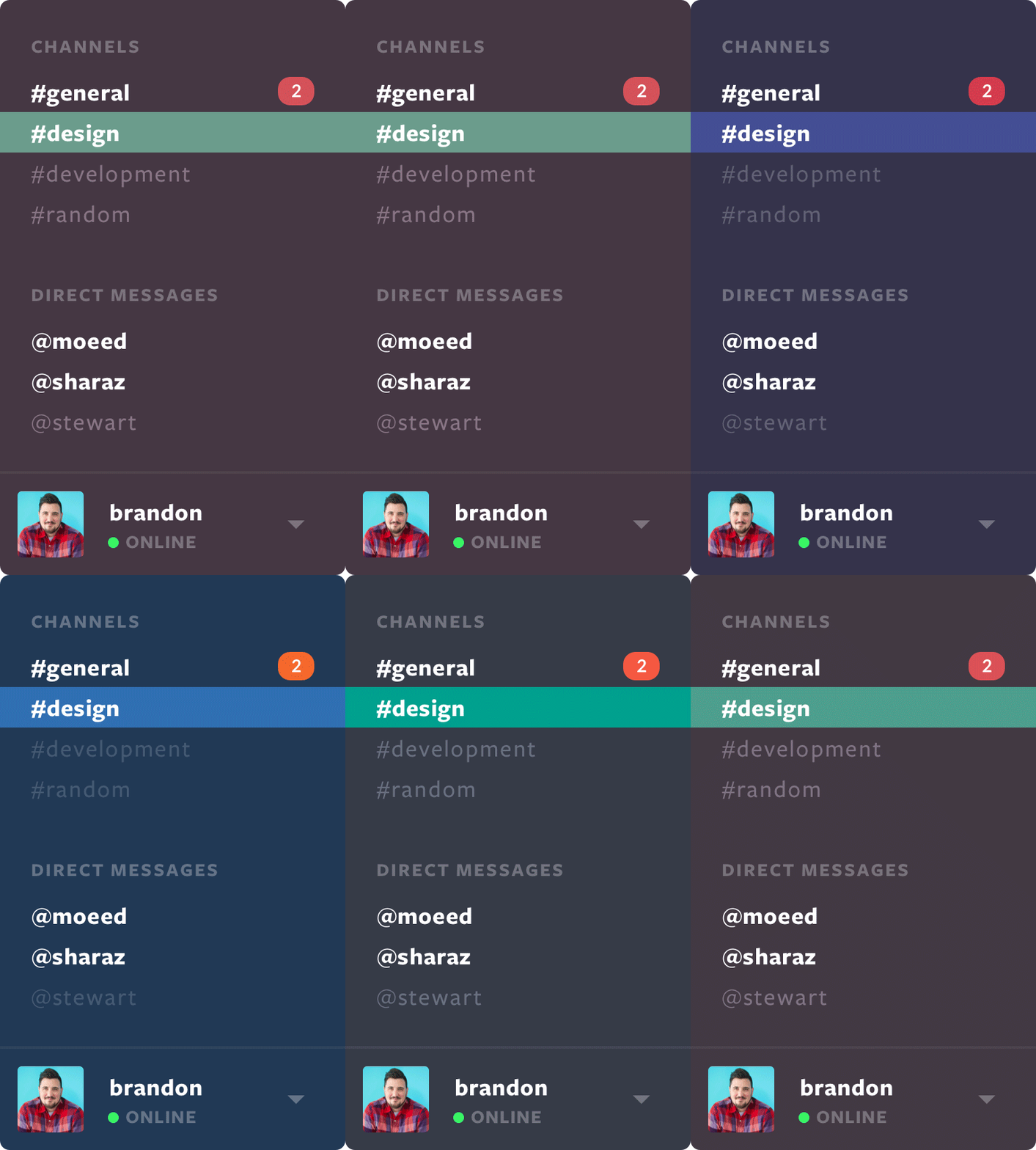
In a crowded space, and seemingly saturated market, Slack instantly became a cult hit by challenging the norm. It's beloved for its gorgeous, playful interface and tons of delightful little interactions throughout the app.
In a crowded space, and seemingly saturated market, Slack instantly became a cult hit by challenging the norm. It's beloved for its gorgeous, playful interface and tons of delightful little interactions throughout the app.
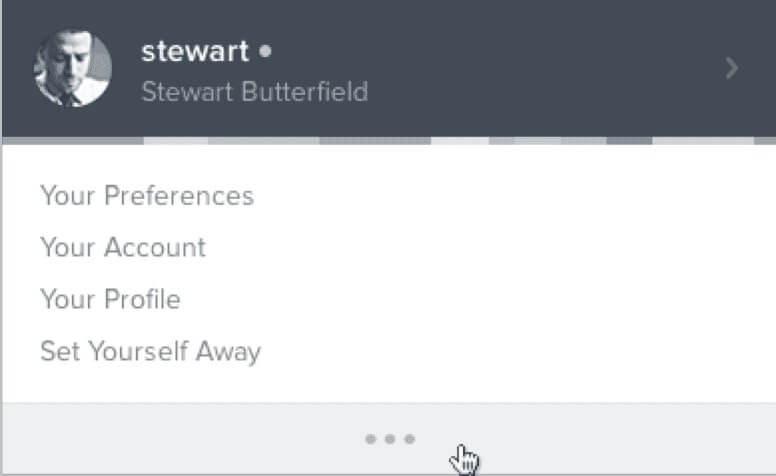

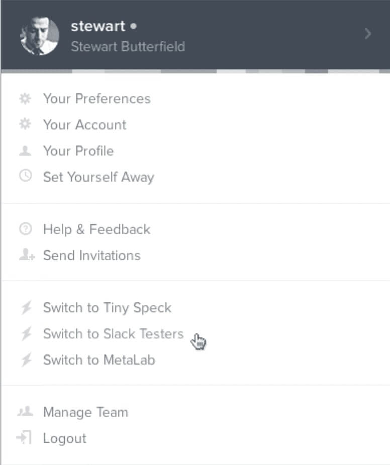

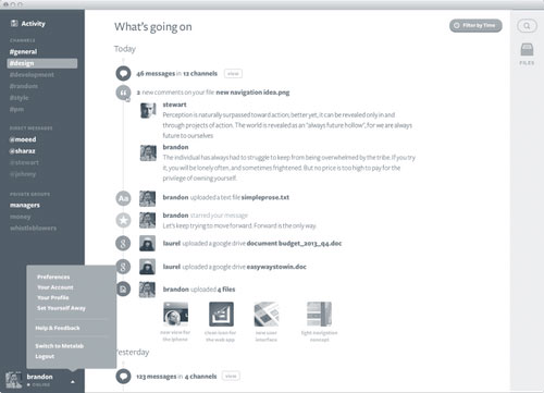
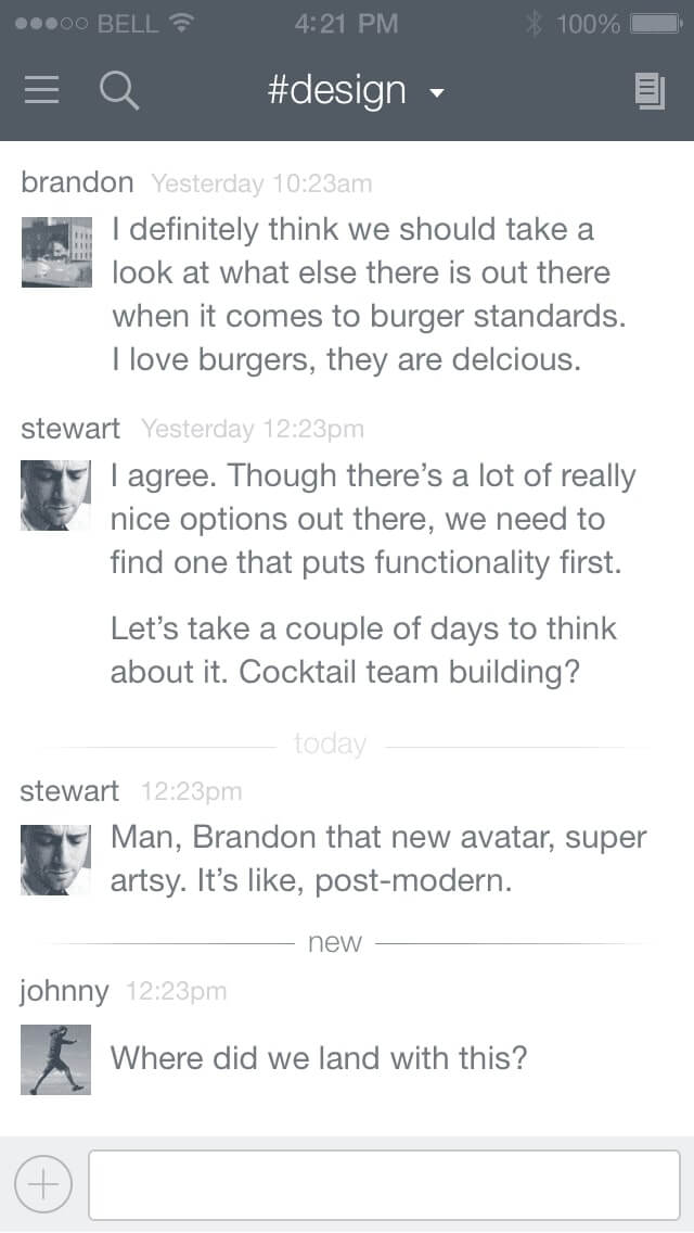
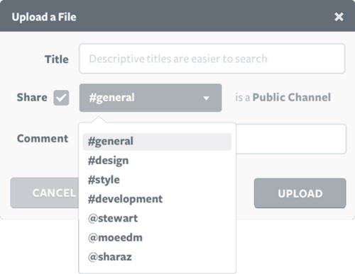
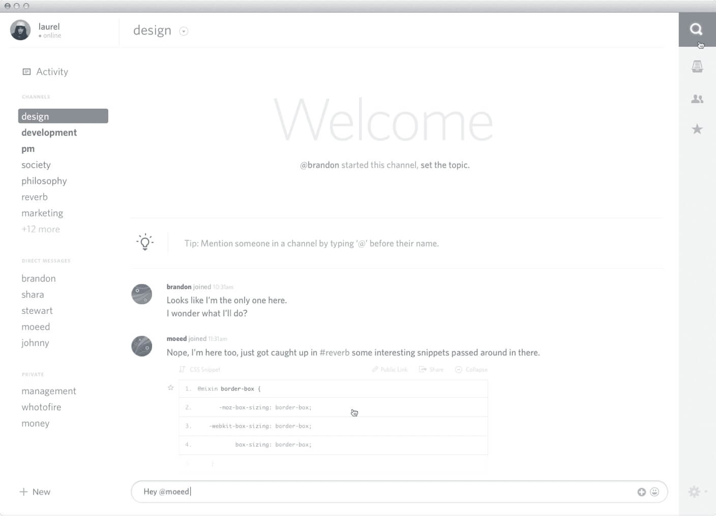
Early UI Explorations
We were there from the start. Understanding the value of design,
Stewart and his team came to us when Slack was a rough unstyled
prototype and asked us to help make it great.
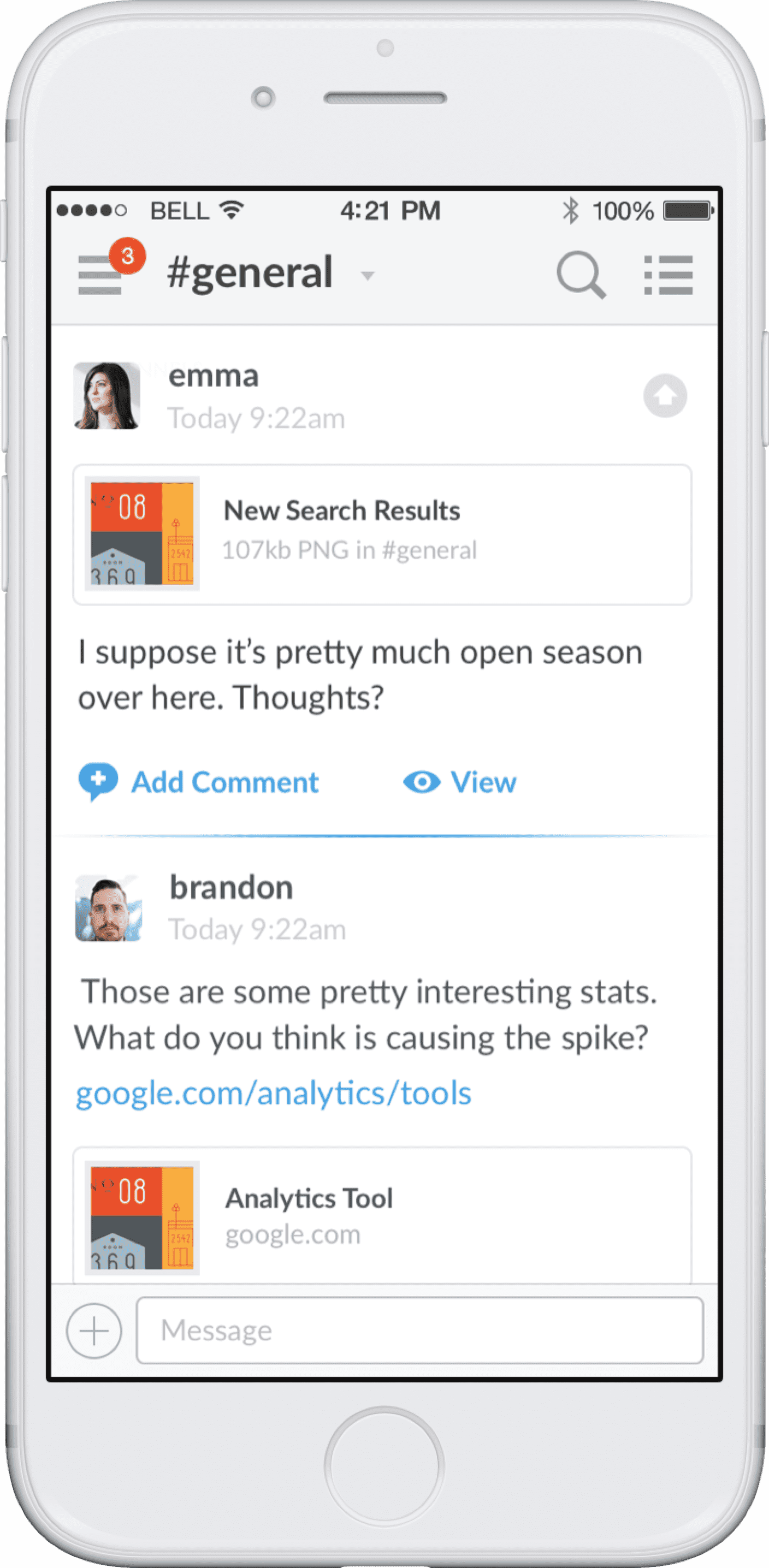
We worked with him to design the app from the ground up—along with the brand, the mobile app, the marketing site—the works.
We worked with him to design the app from the ground up—along with the brand, the mobile app, the marketing site—the works.
.png)
.png)
Buh-bye, email
How we stood out
At a time when business applications were dull and boring, and
workplace communication depended almost entirely on email, our
aim was to make Slack stand out from the crowd. Our guiding
question—why not?
We wanted Slack to be something people would pull up and talk about with their friends at the bar rather than leaving behind at their nine to five.
We wanted Slack to be something people would pull up and talk about with their friends at the bar rather than leaving behind at their nine to five.
It sounds different
Slack bucks the enterprise app trend of dull language that
leaves users lost and unengaged.
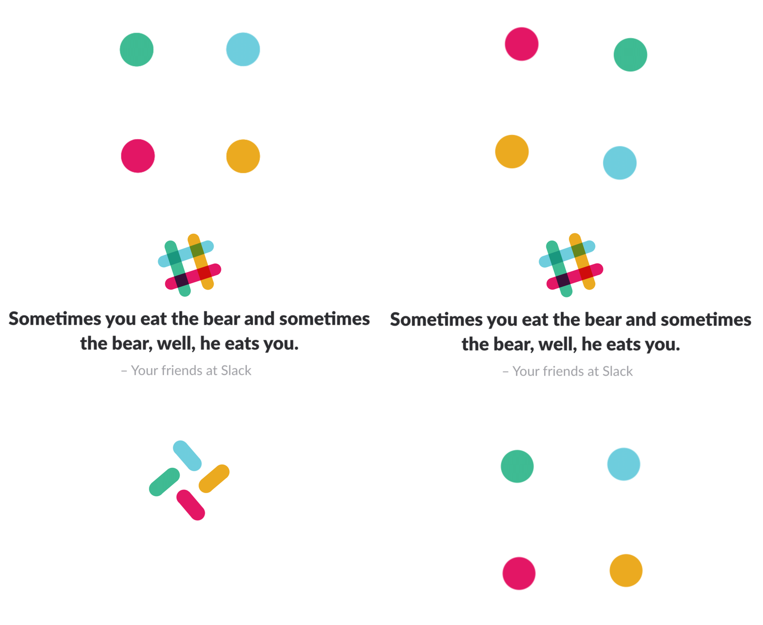
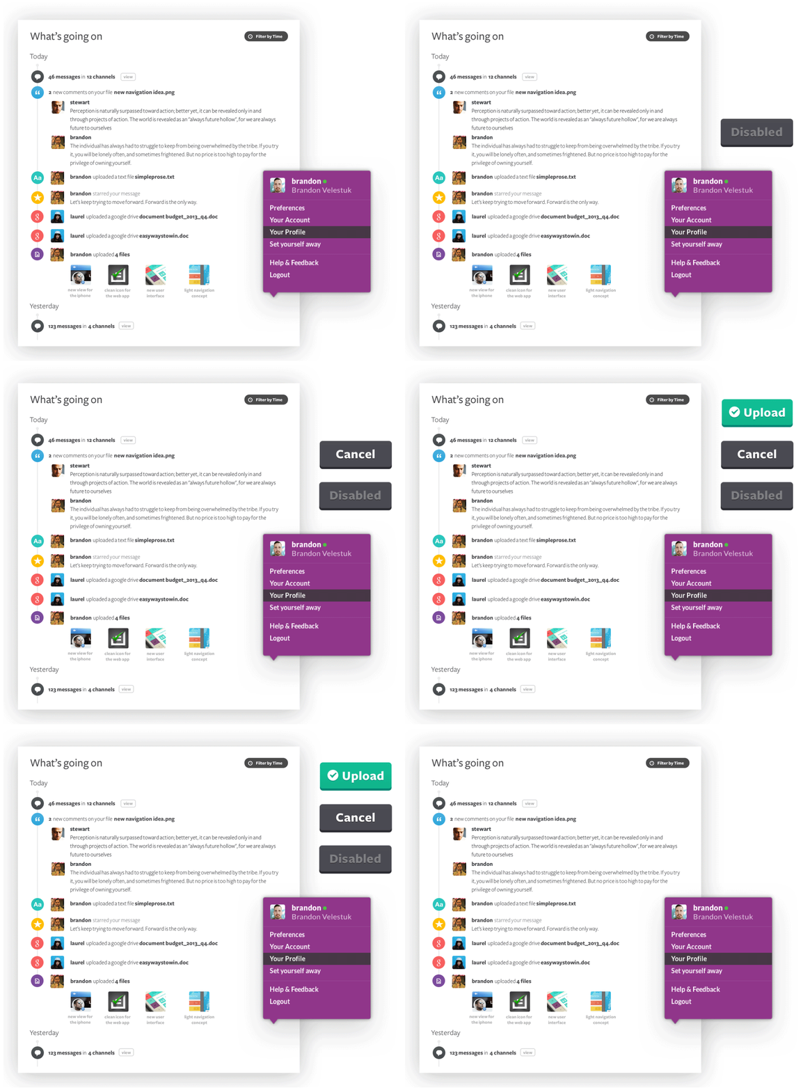
Instead, each piece of copy is seen as an opportunity to be playful. From the loading screen to the error message, Slackbot acts as your wise-cracking robot sidekick, providing injections of fun on those boring days.
Instead, each piece of copy is seen as an opportunity to be playful. From the loading screen to the error message, Slackbot acts as your wise-cracking robot sidekick, providing injections of fun on those boring days.
It feels different
We strived to fill the product with delightful, and
unexpected, interactions—the logo animates in a burst of color
as it loads, the modals slide down from the top of the screen,
gifs appear at random like Russian roulette.
Throughout the entire app, everything seems to playfully jump around and pop off the screen. Each of these moments is designed not only to help the user understand what's going on, but put a little smile on their face.
Throughout the entire app, everything seems to playfully jump around and pop off the screen. Each of these moments is designed not only to help the user understand what's going on, but put a little smile on their face.
.png)
Centering around messages was key
Several people are buying…
When Slack launched in 2013, its unique design and playful
features seemed to instantly steal the hearts of millions. Its
widespread adoption has made it the fastest growing business
application of all time.
Today, Slack is publicly traded and has a valuation near $25 billion.
Today, Slack is publicly traded and has a valuation near $25 billion.
Pat Kinsel
Founder of Notarize
Metalab makes products delightful. It’s really that simple.
John Doerr
Partner, KPCB
Never before have we witnessed so much user love for an enterprise software platform.

